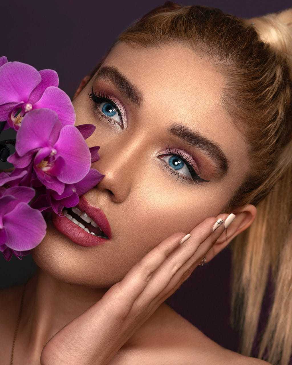
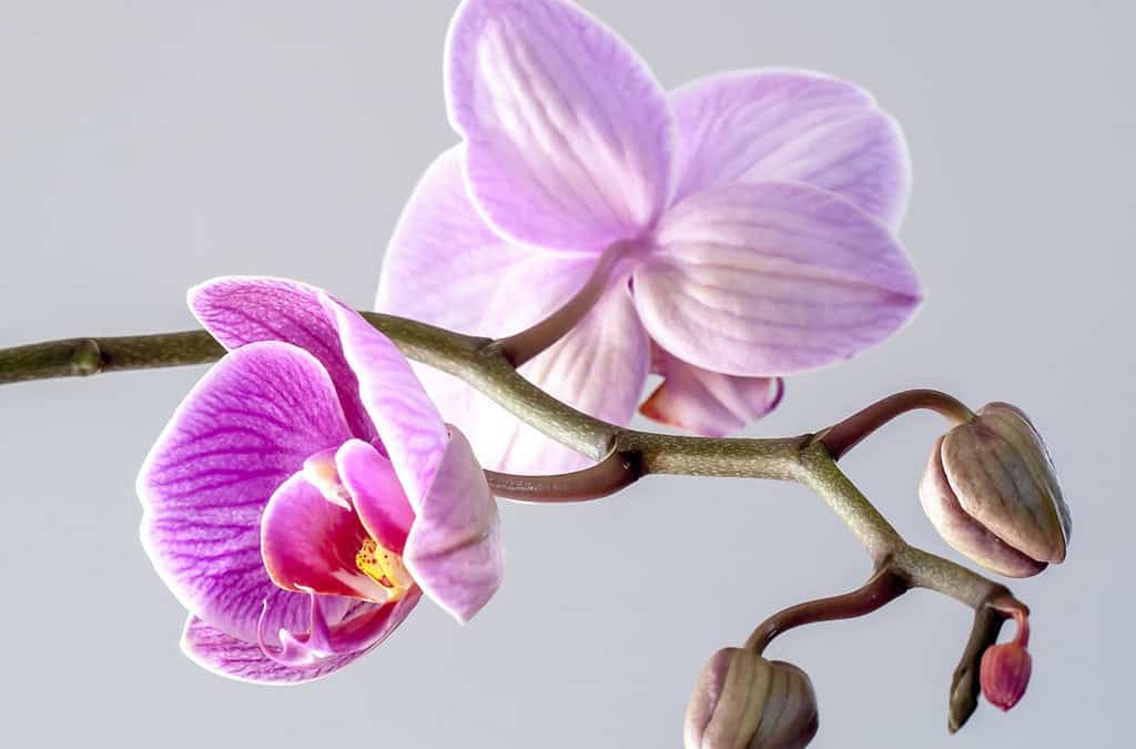
Move over, emerald. The color watchers at Pantone recently revealed the Color of the Year 2014: PANTONE 18-3224 Radiant Orchid.
Food and beverage marketers have begun lining store shelves with dusty fuchsia-inspired products while the “it” hue is already dominating celebrity red carpets and clothing displays.

An enchanting harmony of fuchsia, purple and pink undertones, Radiant Orchid inspires confidence and emanates great joy, love and health. It is a captivating purple, one that draws you in with its beguiling charm.
To arrive at the selection, Pantone quite literally combs the world looking for color influences. This can include the entertainment industry and films that are in production, traveling art collections, hot new artists, and popular travel destinations.
Color lovers: Are you a fan of the hue? What do you think should have been Pantone’s Color of the Year?


