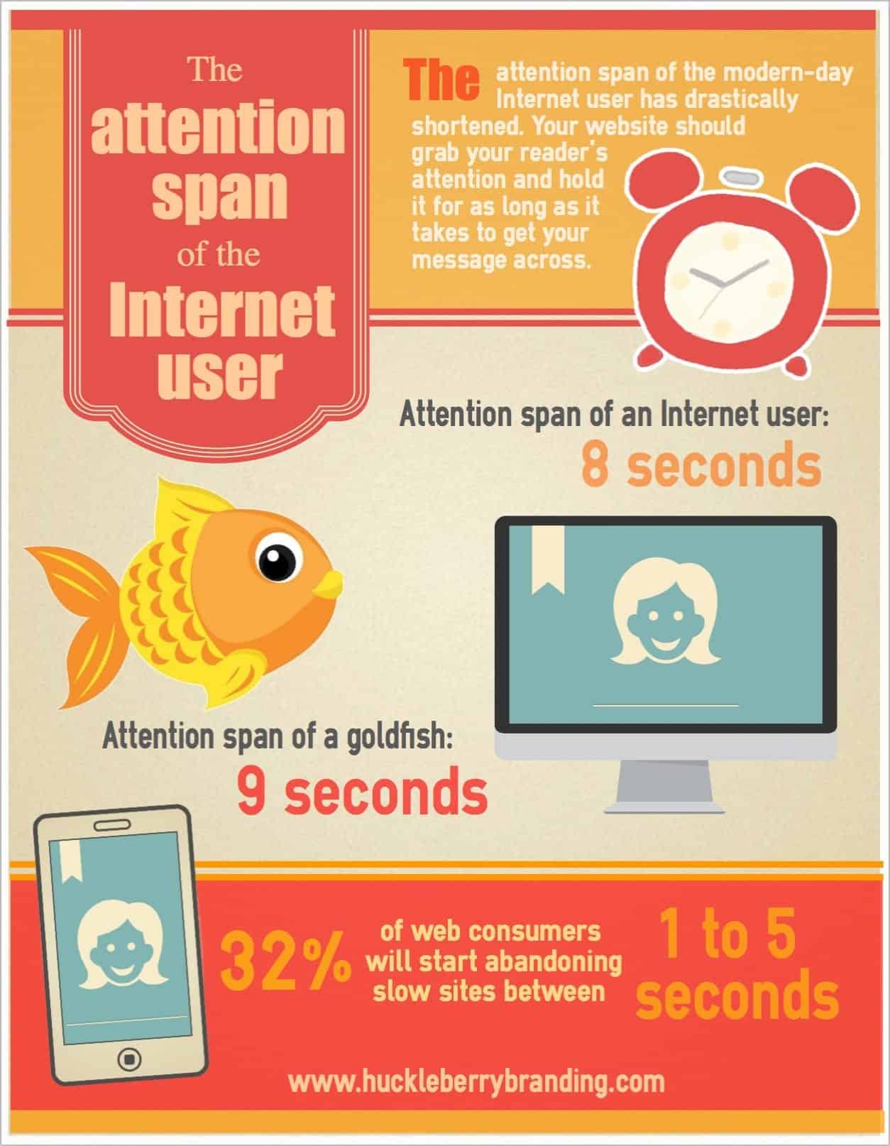
Quick! You have eight seconds to engage your website audience. What do you do? The average Internet consumer’s attention span has drastically shortened. Instead of a whopping 12 seconds to get your message across, you now have eight. With a wealth of information available online and your competitor’s site just a click away, your landing page should grab your reader’s attention right away, hold it for as long as it takes, and ultimately get your message across. In a world of instant gratification, keep these tips in mind to clean up your website and engage your audience.
- Capture your readers’ attention. With only a moment to draw your reader in, consider your end goal first. Place the most important conversion or call-to-action copy up top. Keep your content short and punchy.
- Present information in a logical order. Don’t make your reader work too hard to find out what your text is all about. Clearly lead your reader through your copy in a rational, sequential order.
- Accommodate easy scanning. People don’t read web pages, they scan them. Use brief, descriptive subheads and bullet points to make your message easier to digest.
- Ensure pages load quickly. More than 30% of Internet consumers begin abandoning slow-loading sites within 1-5 seconds. With so many great resources out there to speed up your site, there is no excuse to have slow-loading pages. Here are a few freebies:
- Use rich media. Visual elements — like graphs, a short video or compelling graphics — are great ways to break up your text and tell your story in a more dynamic way. Try easel.ly for free infographic creation or online video creation tools like WeVideo or GoAnimate to enhance your website’s interactivity.
- De-clutter your pages. To keep your landing page message concise, use secondary pages to present more detailed information about your individual products or services.
- Make the call-to-action clear. Once you hook your reader, make sure the path to conversion — whether it is a sale, a subscription or service inquiry — is clearly defined. Leave obvious breadcrumbs en route all the way from your initial sales pitch to your call-to-action.
When mapping out your website, keep your user’s experience and attention span at the forefront of your design. With only a few brief moments to hook your consumer, your website should flow seamlessly and engage your audience immediately.


